Ripley's Total Car Care
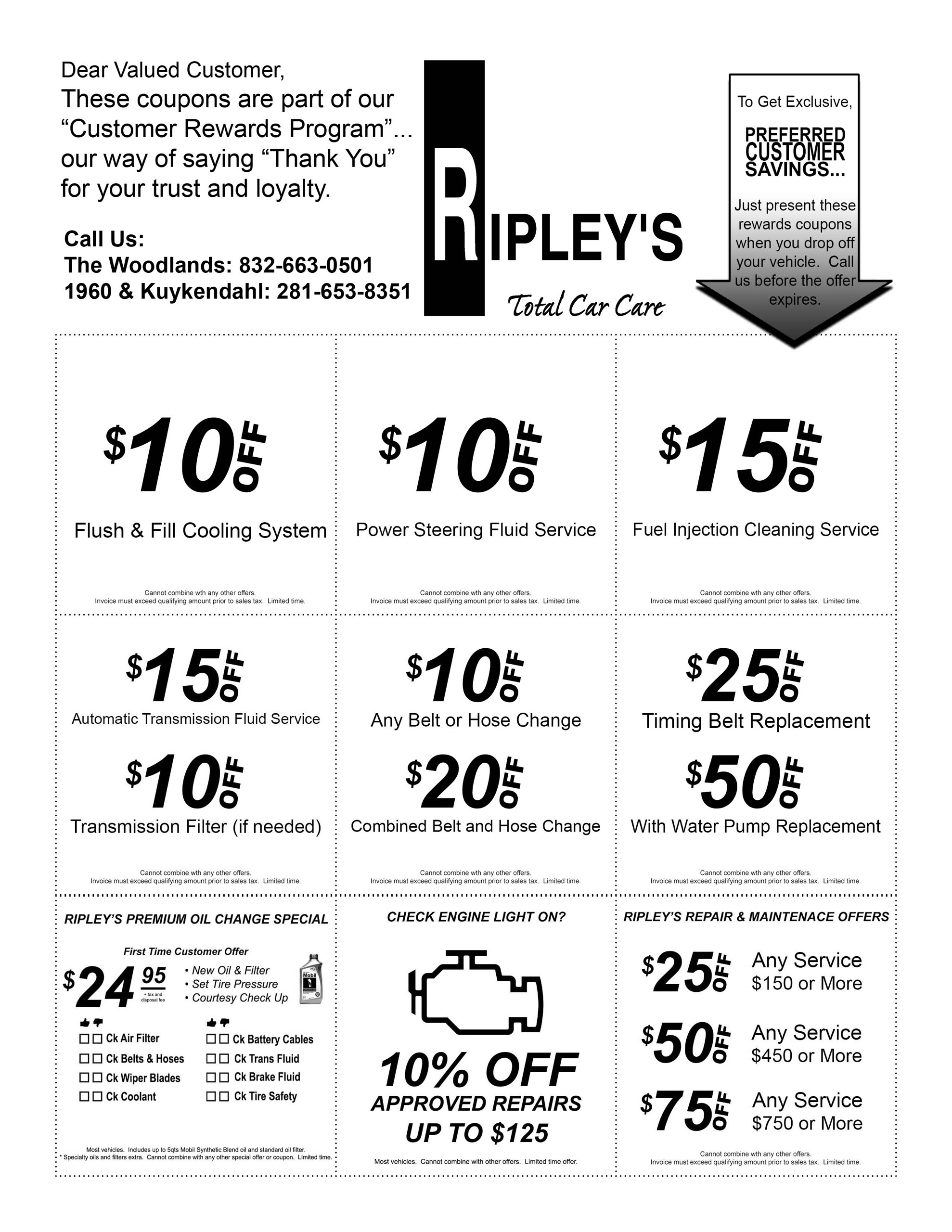
On this marketing material project for Ripley's Total Care, I was tasked with creating multiple promotional materials that were to be used for Google Ads, the client's website, email newsletters, and in person handouts.
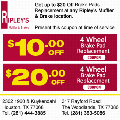
This coupon ad was the first piece of the marketing material for their promotional campaign. They wanted to include a lot of information yet retain these specific dimensions for their Google Ads usage. However, with some text alignment techniques
and visual tricks, I was able to squeeze on all the necessary information while still retaining the organizational and visual fluidity.
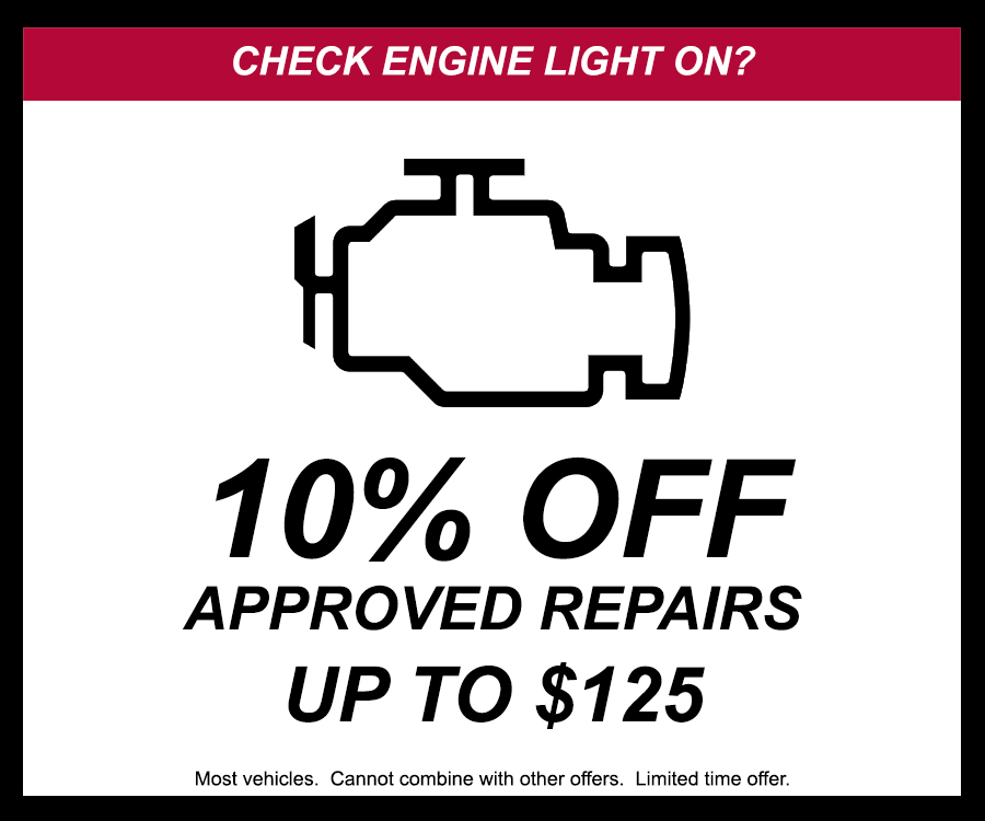
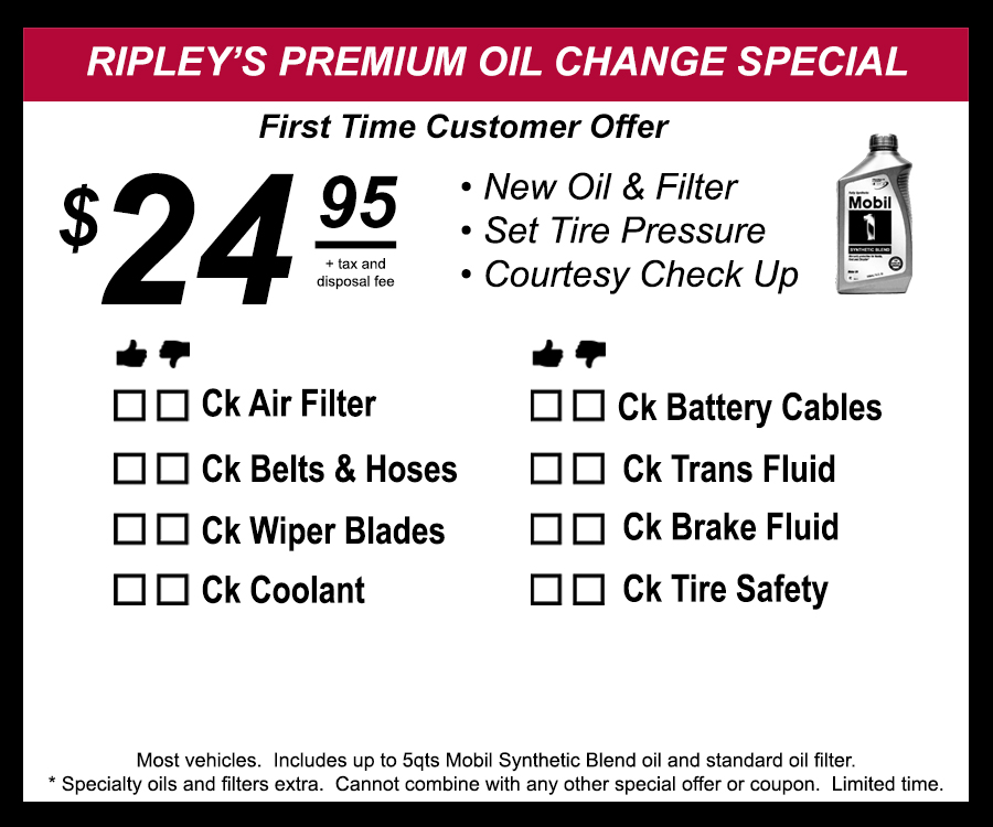
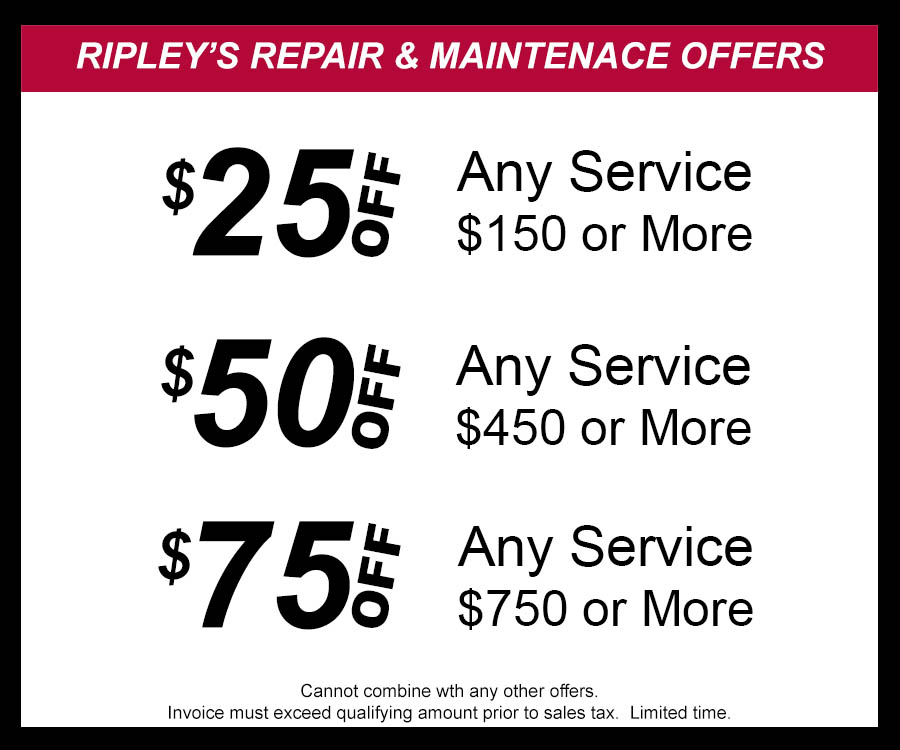
This second set of coupons was for their email newsletter and customer referrals during the holiday season to bring in new clients. The client wanted a design that was bold yet simple, so I went with bold lettering with a hint of red to adhere to Ripley's brand identity.
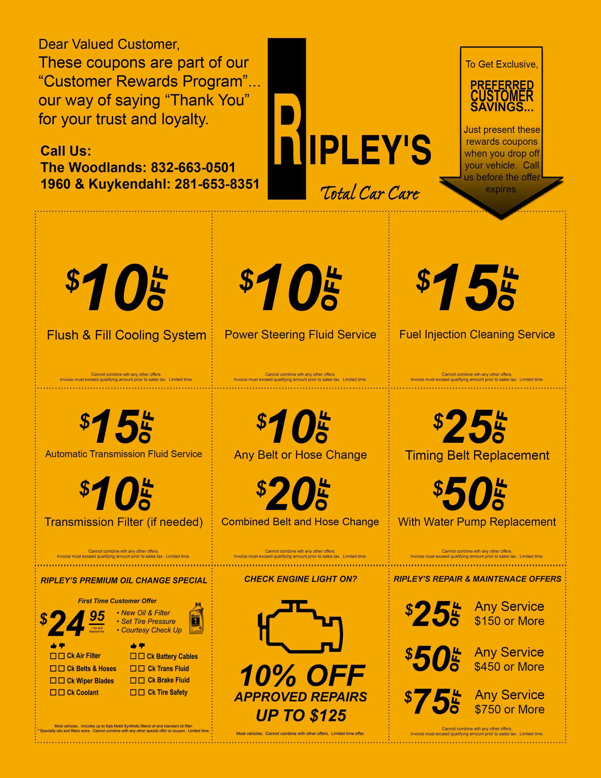
For the last promotional piece of media, the idea for this layout came from the owner of Ripley's when he saw a friend of his with a similar design that they called the golden rod. The owner requested for me to make a similar version of it so that they could incorporate a Ripley's branded version for their marketing and promotional material.
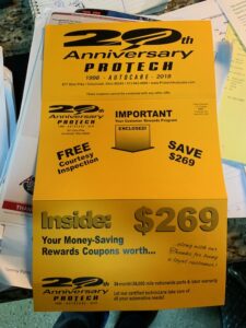
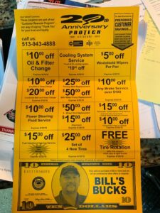
As pictured below, I was able to recreate a near identical replica of the original version, albeit with my own design tweaks.
This final set of promotional materials are the same, just alternate color variations.
Ripley's Total Car Care
On this marketing material project for Ripley's Total Care, I was tasked with creating multiple promotional materials that were to be used for Google Ads, the client's website, email newsletters, and handouts.
This coupon ad was the first piece of the marketing material for their promotional campaign. They wanted to include a lot of information yet retain these specific dimensions for their Google Ads usage. However, with some text alignment techniques and visual tricks, I was able to squeeze on all the information while still retaining the organizational and visual fluidity.
This second set of coupons was for their email newsletter and customer referrals during the holiday season to bring in new clients. The client wanted a design that was bold yet simple, so I went with bold lettering with a hint of red to adhere to Ripley's brand identity.
For the last promotional piece of media, the idea for this layout came from the owner of Ripley's when he saw a friend of his with a similar design that they called the golden rod. The owner requested for me to make a similar version of it so that they could incorporate a Ripley's branded version for their marketing
and promotional material.


As pictured below, I was able to recreate a near identical replica of the original version, albeit with my own design tweaks. This final set of promotional materials are the same, just alternate color variations.

